About the client
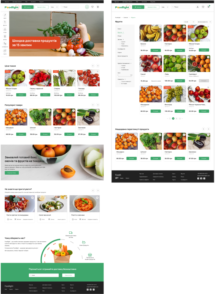
We launched fast delivery of very high quality products (vegetables, fruits, etc.). At the same time, all products look "Instagram": beautiful, not mint, not rotten, you want to eat them and you are not afraid that you will receive low-quality products.
Project goals
Create a fast and convenient site for ordering products to automate and speed up orders. Thus, increase the number of customers, because many customers go through an inconvenient ordering processClient wanted not just a standard website for vegetables and fruits, but a cool, trendy, at the same time SIMPLE and minimalistic website with accents.
Key challenge
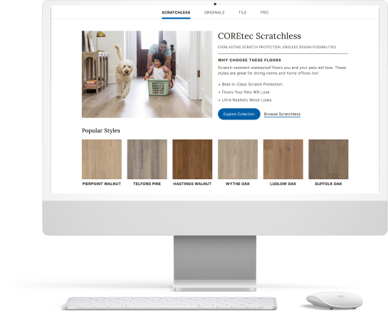
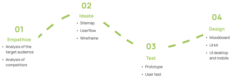
Design process included a lot of research that helped to create the most effecient and easy to use website. It included competitor analysis, analysis of target audience, userflow and user testing on the stage of prototype. User testing is the most important to ensure the website is easy to navigate
Our solutions
Design mockups and prototype in Figma for all pages needed for ecommerce process and as well adaptive version for mobile
Design process

Analysis of the target audience
What? Delivery of quality and fresh products
Who? Women/man 20-35 years old
Why? Want to quickly buy quality products
When? Several times a week
Where? Online
Sitemap
After analyzing the information that needs to be added to the store website, I created a sitemap that has 7 main sections: products, shopping cart, personal account, about us, delivery and payment, FAQ, contacts.

Userflow
In order to provide a simple purchase path for the user, I created userflow. It also helps to check at the initial stage of design that all stages are logical, clear and complete.

Wireframe and prototype
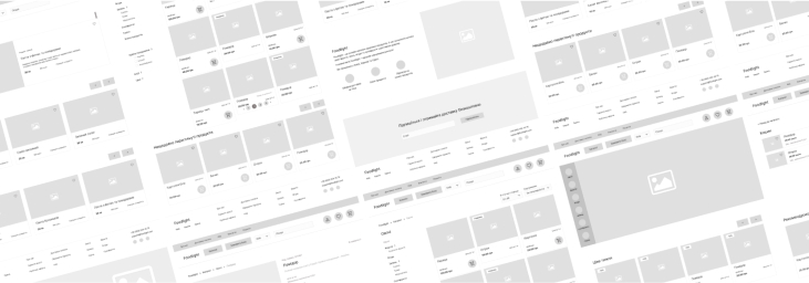
After the research, we created a Lo-Fi Wirefram. This helped to pay attention to main blocks and remove extra details that may distract user`s attention. Then added content and states and created Hi-Fi Wireframe. Based on that we connected all to Prototype.

Result
Earlier company used just Instagram for order and communication with clients. Now it is much easier both for client who spend less time waiting for reply and for the company to process more orders and hire less staff.
